Letter
A headline with a measured pace
Compare a compact setting with a more open one and consider the tone each gives the same words.
Editorial structure for physical publications
Sivamoreku studies the reader's journey through type, images and paper. Build a publication whose hierarchy and pacing remain clear in the hand.
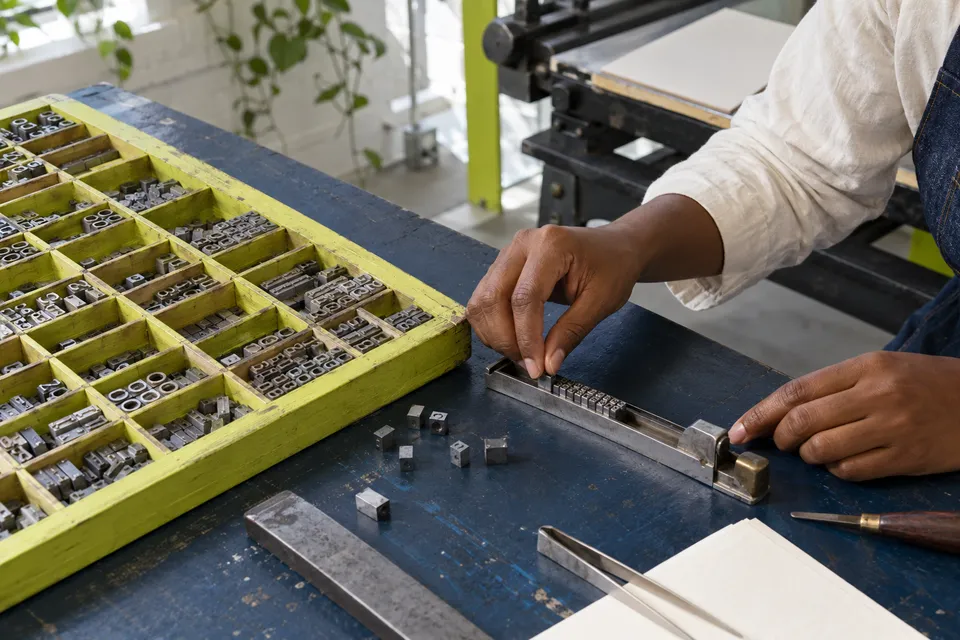
Decide what the reader should understand at each stage. The layout can then support a sequence of discoveries instead of giving every fragment the same emphasis.
02 / Working modes
Follow a spread from entry point to detail to continuation. Mark where your attention changes direction and whether that turn is supported by the content.
Choose one passage that needs a different level of emphasis. Test a change of scale or spacing before adding a decorative distinction.
Ask a reader to locate a particular reference or image. Observe whether the page's cues are sufficient without spoken assistance.
03 / From eye to hand
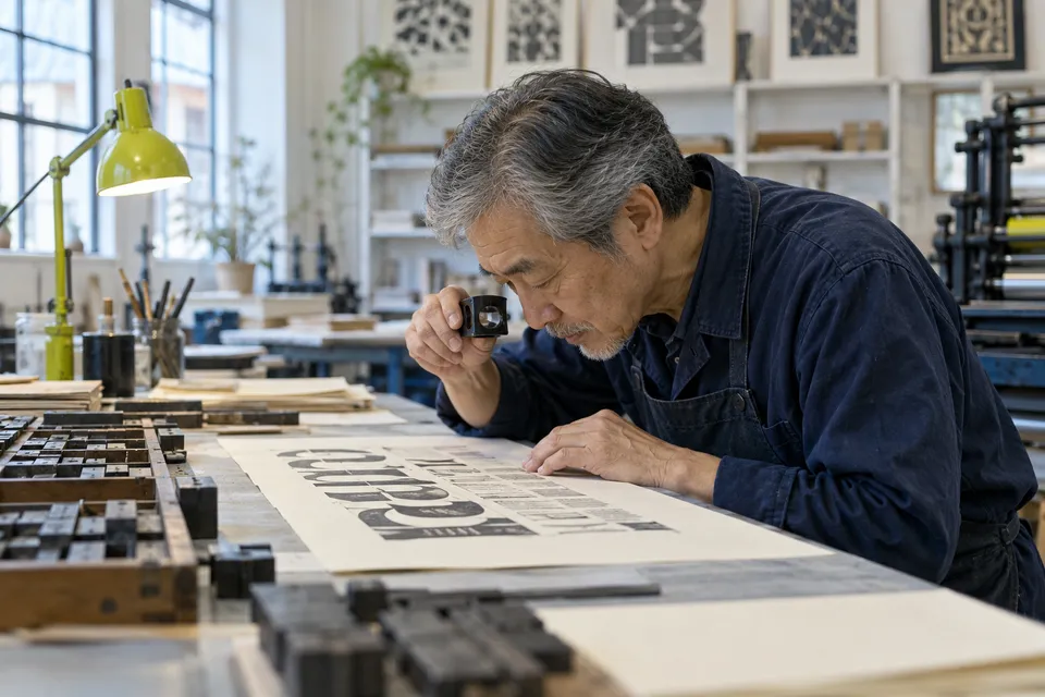
Hold the sample, open the spread and inspect its smallest useful text. A page should be assessed at a plausible distance, with its actual scale visible.
Compare a compact setting with a more open one and consider the tone each gives the same words.
04 / A route through the edition
Establish the content sequence, refine the hierarchy, check the physical proof and prepare the final object. Avoid polishing a page whose role is still uncertain.
Compare a compact setting with a more open one and consider the tone each gives the same words.
Place a short note where it adds context without breaking the main reading route.
Move an image reveal onto the next spread and inspect the resulting delay.
Test whether captions, folios and notes share a recognisable but quiet voice.
05 / Editorial conversation
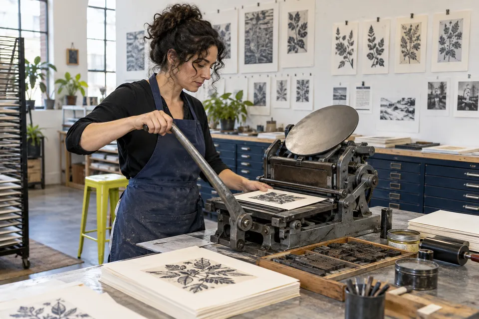
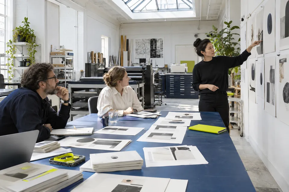
Give the publication to someone who has not followed its development. Their pauses and detours can reveal which cues are doing useful work.
06 / A reference index
Select a letter, page or book question and make one comparable change. A reference becomes useful when it can be translated into an observable reading effect.
5 prompts available
Compare a compact setting with a more open one and consider the tone each gives the same words.
Place a short note where it adds context without breaking the main reading route.
Move an image reveal onto the next spread and inspect the resulting delay.
Test whether captions, folios and notes share a recognisable but quiet voice.
Repeat one helpful location marker while allowing the surrounding composition to vary.
07 / Proofing session
Use these marks during the current reading session. Reloading clears this checklist, matching its role as a temporary proofing aid.
0 / 6 complete
08 / A physical reading room
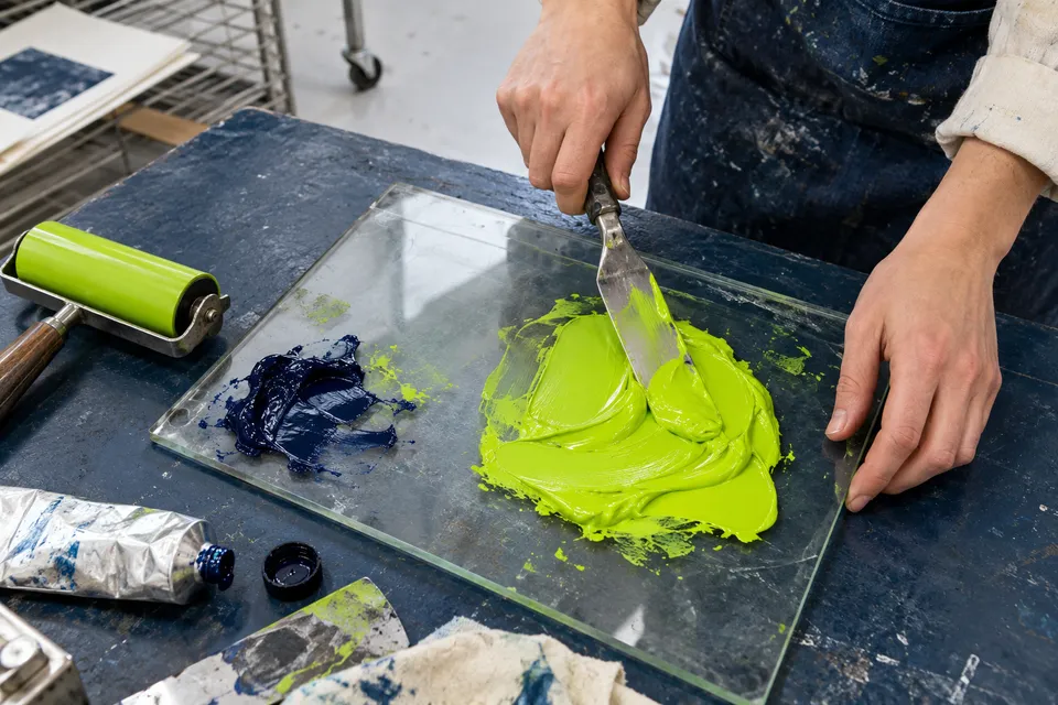
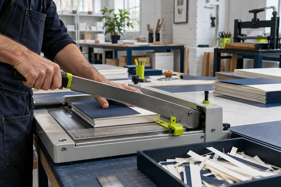
Arrange successive proofs in order and annotate the intention behind each revision. The comparison should explain why a change was made, not simply which version is newer.
Read the editorial exercises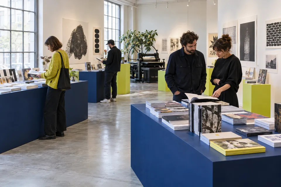
09 / Showing the work
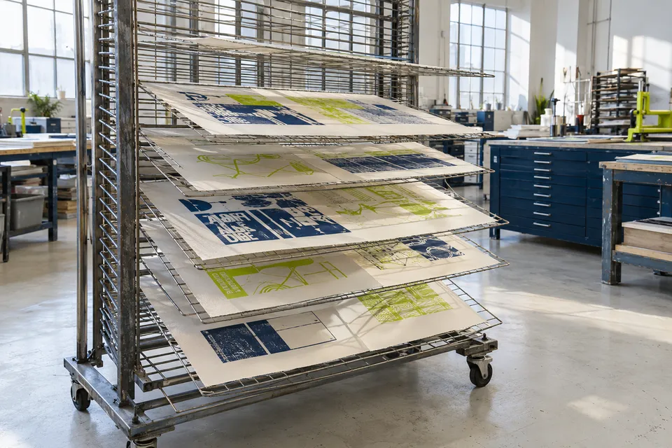
An exhibition of publications should provide enough space and context to understand their scale. A closed cover cannot explain every quality of a reading object.
Repeat one helpful location marker while allowing the surrounding composition to vary.
10 / The resulting object
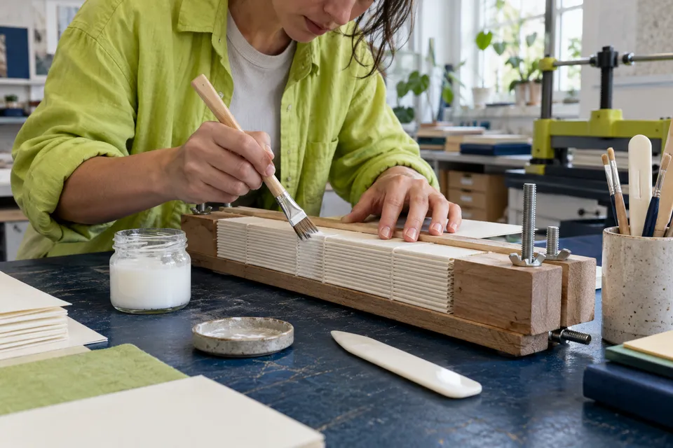
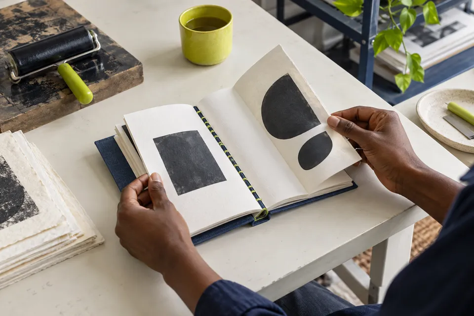
Turning a real page introduces time and resistance. Reconsider a reveal or an image transition if the assembled object changes the pace you expected.
11 / Practical typography
These suggestions focus on what can be observed in a proof. Use them to choose a concrete revision instead of applying a general rule mechanically.
12 / Production memory
A short record of format, sequence and hierarchy can help another person understand the edition. Include the reason for a constraint as well as its measurement.
Ask a reader to locate a particular reference or image. Observe whether the page's cues are sufficient without spoken assistance.